Thursday, June 23, 2011

Specialty Mat Cuts+++

Want to add drama and art to an otherwise simple frame job? Consider specialty mat cuts that enhance the overall appearance. Here are some specialty mat cuts I'm particularly proud of. The artwork is a collection by the artist Shag. Actually, his name full name is Josh Agle, a painter, illustrator and designer working in Southern California (Shag is a combination of the last two letters of his first name teamed with the first two letters of his last name). His original intent was to become a commercial illustrator, but his fate changed with the demand for his originals by galleries and collectors in all over Japan, Europe, Australia and the United States.


This piece is Drunken Cleric (a limited edition lithograph by Shag). The customer came in with a photo of this piece framed with a similar unusual mat cut. He asked if Corners could reproduce the unusual mat cut in his photo, but still show off the original signature by Shag. Because we are unsure of the copyrights on the original photo we opted not to post it here.

This particular customer opted for a more classic, contemporary black frame. However this piece could easily have been framed in bamboo, rattan, or carved wood to accentuate the tropical bar theme even more.

The bamboo border mat cut goes great with the Tiki Bar theme of the image - framing the piece nicely. Specialty mat cuts continue the artwork outward making them appear larger. Care must be taken not to overshadow or distract from the original art. The best mat designs lead you back into the original paintings and accentuate details you may have missed at first glance. For example, the thin bright orange mat used in the border accentuates the orange in the piece, drawing the viewer's eyes to the blow-fish lamp, the bar decoration, and of course the drunken cleric passed out on the floor - the point of focus for Shag's painting.


After noticing the focal point, the viewer is free to look for other details at their leisure. I Love these two guy's expressions at the sight of the cleric - everyone's a critic...


Of course the customer's request was met, and the signature shows clearly.


This customer was so impressed with the mat cuts, he brought in two more Shag's for similar treatments. This time, he gave me even more creative freedom.

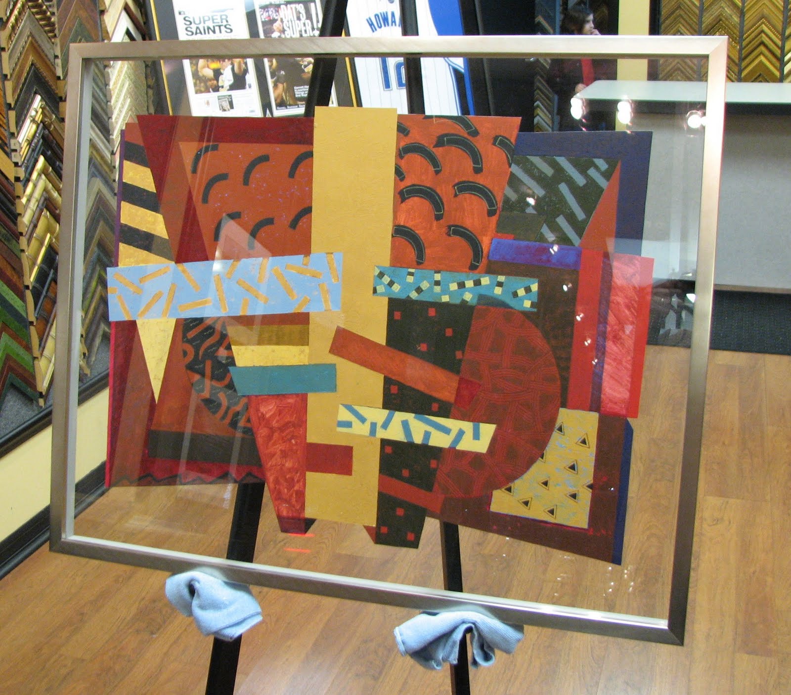
The next is a poster titled The Pirates Hobbies.


In this design, pieces of the pipe and wall accents in Shag's underwater pressurized room seemed logical choices to use in the mat design. Through the use of repetitious cutouts around the image, the scene is the focal point - even though the matting commands attention. It is the consistency of the pattern that frames the piece.


With so many cutouts or details, too many (or too bright) mat colors would have been distracting to the viewer. In this particular instance, it is the simple black frame that leads the viewer back into the painting, and more specifically to the pirate and his cat.


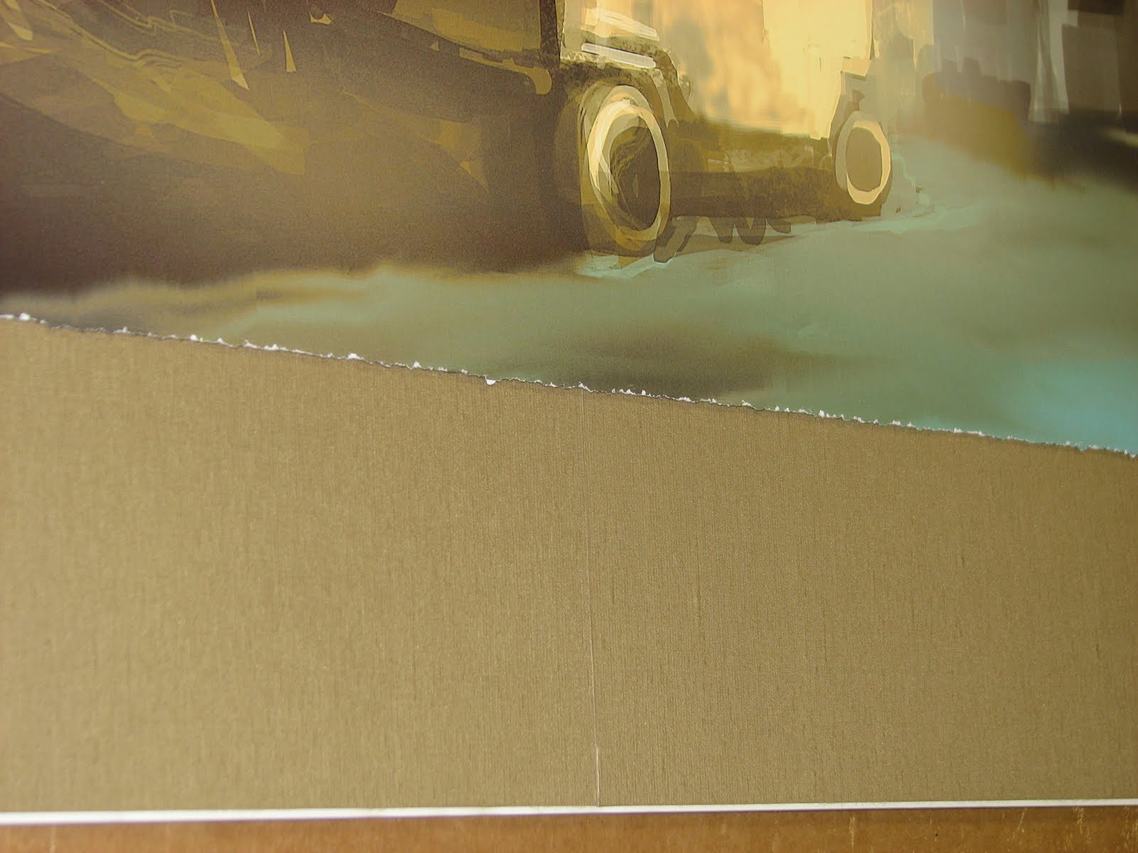
This was an unsigned print, so I matted it directly to the image. I was happy for this because the white border would have distracted (or disrupted) from the continuation of the background in the painting through the matting.

Of course I was sure to leave the printed Shag signature showing... and added my own "X" signature to the mats - in the form of crossbones. Of course the skull and bones were a compliment to the one on the pirate's hat (Shag-style).

The third piece is another limited edition titled: Melancholy Werewolf.


Again, using the image as inspiration, I chose to continue the story of the artwork on to the mat. My original thought was to use the tree for inspiration, with branches and leaves in similar tones. While this would have worked fine, and reiterated the forest theme, it's Shags characters that are so unique. I found myself mesmerized by the glowing orange eyes of the blackbirds and wanted to draw attention to them. The thin orange mat would not work here, glowing orange footprints would command too much attention away from the birds eyes in the image. The solution was to create a glowing eye of our own as part of the image.


I love how Shag painted these birds eyeballing the steak!


Surely this piece would have been fine with just little birdie footprints to frame it. In fact, adding a character to the matboard can be very distracting. The last thing a professional picture framer wants is to lead a viewer with a conflict, do you admire the artwork or the mats? Every framer knows that their job is to enhance artwork, not detract from it. In this particular case, the eye was cutout on this little bird to show its interest in the steak, even after the little stroll around the mat. Its this tiny little character trait that makes our bird part of the piece and draws the viewer back into the story of the art.


The Triple Play!
Winter Park, Orlando, Fern Park, Baldwin Park, Maitland, Oviedo, Winter Springs, Casselberry, Lake Mary, Windermere, Metro West, Central Florida ,Florida, Matting, Mats, Framing, Framed, Frames, Custom Picture Framing, Picture Framing, Picture Frames, Custom Framing, Custom Frames, Frame www.cornerscustompictureframing.com

Thursday, October 7, 2010

Framing A President


Framing A President

So, it's been awhile since my last blog. I received an enlightening phone-call from a potential customer asking, "Are you still in business?". It was a very simple question that at first I couldn't figure out why someone would ask. Aside from the obvious economic difficulties faced by many, I couldn't (or didn't) consider the impression my lack of blogging was making in regards to the overall "appearance" of things here at Corners. So I assure all of you, yes, I am still in business. In fact, I've been blessed with many interesting orders that have kept me far too busy to create a blog entry. Never mind finding the time to compile the photos, put the photos with the story, have the wife proofread for grammar and spelling, and then post. In between that, finding time for daily Facebook posts and tweets, keeping up with Google and other search engines. Man, keeping up with the internet is a full time job!

On my way to work almost every day, I find myself at a traffic light behind a SUV wallpapered with clever bumper stickers. I'm reminded of one of those bumper stickers here: "Top 10 reasons I procrastinate: #1...". The bottom line, there is no acceptable excuse, is there? Time to stop the procrastination and as Nike puts it, "just do it".

This blog is about the framing of a 1913 newspaper. As you can see in the photos, the newspaper is torn and worn. The customer wanted to present the newspaper cover page as a gift. The importance of conservation techniques took a back seat to overall presentation of the piece. Don't get me wrong, the client was concerned with preserving the integrity of the newspaper, but decided that permanently mounting the piece was more important than avoiding the use of adhesives. Franky, I don't blame him. With the paper literally crumbling to the touch, mounting the paper was a high priority to eliminate any more flaking. Besides, you can enjoy a framed newspaper hanging on the wall far more than one kept in an archival sleeve or a lock-box in storage! With a quick treatment of Magnesium Oxide (in a water-free formula) to neutralize the acid in the newspaper, I began the framing.

The first issue I addressed was the holes in the newspaper (where the paper was missing). When mounted to a backing board, the foamcore would show through as a bright cream color. This would be a huge contrast to the dull aged newspaper color. The end result would be a bright, distracting color that would draw the eye away from the overall presentation and to the flaws of the artwork. Matboard color matches to the yellowing of paper and the grey of the print were found to replace the missing sections.

When the newspaper is vacuum pressed and mounted to the matboard, the line between each matboard would be permanently pressed into the newspaper. To avoid this, I stripped the top layer of matboard from the core of the cream colored mat. Then I stripped an equal size piece from the grey colored matboard. The matboard is then vacuum pressed and mounted together to become one, solid, two tone matboard. The newspaper could then be mounted to this single board to hide the holes in the paper.

The newspaper was finished off with an ornate, traditional, black wood frame with a masculine influence - replicating a 19th century design. The result is a frame that truly fits the piece - in more ways than one!
Winter Park, Orlando, Fern Park, Baldwin Park, Maitland, Oviedo, Winter Springs, Casselberry, Lake Mary, Windermere, Metro West, Central Florida, Framing, Framed, Frames, Custom Picture Framing, Picture Framing, Picture Frames, Custom Framing, Custom Frames, Frame www.cornerscustompictureframing.com

Wednesday, May 19, 2010

Woodstock Ticket


Wow, I've realized how hard it is to keep up with blogs!! It's funny too, because if you know me personally, you know I love to talk and one of my favorite things to talk about is my business. Yet when I have to sit down and type it out... well... as Paulie from Donnie Brasco says: "forget about it".

So it's time to quit procrastinating and get down to typing....

This blog is about a mistake I made in the design process. They say you learn from your mistakes. I did. This blog is about that. It worked out great too. Anyway, I don't want to kill the surprise. So here you go:

This blog is about an original, unused Woodstock ticket and accompanying newspaper article that was recently brought into my store. The client told me that the ticket had belonged to his mother. The first thing I thought was how disappointed his mother must have been for missing the event! But that thought quickly lead to other thoughts about 1969...the style of the 60's, and Woodstock in general. Did you know Jimmy Hendrix was playing at Woodstock? Wow...I have a friend named Jimmy Hendrix... he's cool... no wait... not cool, but groovy... yea... and the ticket's groovy... psychedelic man... psychedelic posters and patterns... flower child...

Sorry...I must have A.D.D. (Attention Deficit Disorder)! My wife says it's a bad thing, but I find it helps when getting creative about a project! My mind wandered about this ticket and how to really show it off, while the customer must have thought I was on something from the 60's. That is, until I started sharing my thoughts...

This customer was concerned with preserving the ticket. He was framing for preservation as a first priority, but also to display it. I suggested doing both, but to make the display a piece of psychedelic art in itself! My first sketch went something like this:


I explained that the groovy pattern would be cut out in one matboard, while using inserts of other mat colors to make up the petals of the flower and other shapes. To make this design really work well, I suggested at least three matboard colors in total.

I could tell the client was trusting me with the design aspects. I knew his primary concern was to preserve the ticket and article. I was also aware of my client's budget for this project. He was trusting me with putting the whole thing together provided my design fit his first two priorities.

The client and I looked up 60's posters on the internet. The client selected three matboard colors that were popular for the time and I went to work. I don't know what happened next. I was measuring and re-measuring the newspaper article as I designed the layout for the ticket. I couldn't help but think that my original design was a mistake. I thought of my client's personal style. While the flowery wavy pattern fit in with the images of the 60's and the ticket itself, it just didn't fit with how the client described his personal style. I was so captivated in doing something original, I completely ignored the obvious. But how do I change this now without costing myself? I immediately thought of my mission statement: "At Corners, you will never hear "business is business" simply because our "business" is you." (www.CornersCustomPictureFraming.com). I made an executive decision to put the customer first, scrap the original design, and start over.

It was not the best business decision, I'm sure! Imagine if you ordered a taco but the waiter brought you a sandwich instead saying "I thought this fit your taste better". I can imagine my clients expression as he received this phone-call: "Um (NAME)....this is Brian from Corners Custom Picture Framing...I'm...um...almost finished with your framing but...um...I need you to come in and look at it - to make sure you like it...um...I changed the design and I'd like to get your opinion before I cut the frame...anyway...uh...thanks.". Yea, not very professional. But hey, people don't pay me for my phone call etiquette, but rather, my creativity and quality in the framing department! Here is what I showed the client:


Fortunately he loved it!

In regards to preservation or conservation, both the matboards and backing of this piece use MicroChamber® technology to absorb acidic gasses that eventually would breadown or destroy the ticket and the newspaper article. The glass used on this project is Conservation Clear with a 99% UV protective film on the inside of the glass to prevent fading from sunlight or florescent light. The ticket and newspaper have both been treated with a de-acidifying chemical to further neutralize acidic gasses within the frame. The ticket is float mounted to matboard using acetate corners (if you look closely you will see them).


This means no adhesives were used on the ticket at all - it is completely removable. Finally, the inside of the frame (or frame rabbet) was lined with a polyester tape with acrylic adhesives to prevent acid in the wood from transferring inside the frame to the artwork. The finished project could be compared to encasing the items within a protective cotton box.

Winter Park, Orlando, Fern Park, Baldwin Park, Maitland, Oviedo, Winter Springs, Casselberry, Lake Mary, Windermere, Metro West, Central Florida, Framing, Framed, Frames, Custom Picture Framing, Picture Framing, Picture Frames, Custom Framing, Custom Frames, Frame www.cornerscustompictureframing.com

Thursday, April 15, 2010

Video Game Artwork


For this piece, we carefully selected matting that provided the feel of being crouched down behind the crates awaiting your chance to shoot back at the attacker. The feel we were going for was that of a player and not a witness. This is very appropriate for video game artwork! If we had selected lighter mats, the observer would feel as if they were watching the action unfold as opposed to participating in the event. Brighter mats would have put the focus on the dark figure hiding behind the barrels. The darker matting causes the brighter gunfire to stand out. Focus is further directed to the center of the picture by the thin yellow strip framing the artwork. Appropriate matting will focus your attention to the center of the artwork.

Fabric mats add visual interest and richer coloring than a typical cotton mat. We chose fabrics that match the artwork and gradually grow darker to the moulding (frame) we selected. The size of this artwork posed a problem. Because the original artwork was over 40 inches long on its own, it forced us to use matting labeled as "oversized". Oversized matting is matting that is available in a 40x60 inch board as opposed to a common 32x40 sheet. The fabric mat that matched the artwork best for the inner color was not available in a 40x60 sized sheet. The client elected to use two 32x40 sheets spliced at the center. The small cut is barely noticeable as an inner mat and the fabric pattern also helps to hide the line. The client was very satisfied with the look! Here are some closeups to see how the line dissipates as the observer steps back even only a couple feet.


We chose a float mount for this original artwork. The artwork is adhered with a small amount of archival adhesive to a 3/16" piece of foamcore board. The float mount causes a dark shadow behind the artwork. This dark halo effect really shows off the deckled edge of the paper. The effect is just plain cool (for lack of a better description). Not only that, but it also gives a great 3-D look to the overall piece. We chose to raise the top two mats by two sheets of 3/16" acid free foamcore. This was to keep the artwork from touching the glass, but also to further enhance the layered look.


The frame was selected to match the picture, the client's furniture and the client's style. The piece could have easily been framed in several frame choices without affecting the piece. But after narrowing the frame choices, the client selected this particular moulding. The frame is unique in that it is has a contemporary flair, but a distressed finish. Its a perfect blend of medium appropriate while fitting the scene as well.

The finished product was framed with Tru Vue Museum Glass for colorless, near invisible, protection. The glass protects from 99% UV - preventing fading. The glass also cuts down on glare. Another masterpiece by Corners Custom Picture Framing!


Winter Park, Orlando, Fern Park, Baldwin Park, Maitland, Oviedo, Winter Springs, Casselberry, Lake Mary, Windermere, Metro West, Central Florida, Framing, Framed, Frames, Custom Picture Framing, Picture Framing, Picture Frames, Custom Framing, Custom Frames, Frame www.cornerscustompictureframing.com

Thursday, April 8, 2010

Float Mount Framing

Many people choose to float mount their artwork. I'm especially fond of this technique for pieces with a deckled edge or uneven borders that have visual interest. A float mount technique is when the artwork is suspended within the window of a mat and the paper's raw edges are visible. Here are a few examples. I'll be sure to add more photos in the future....

This particular example is a Glass Float. In this example, the artwork is mounted between two sheets of glass:

A unique presentation, but careful attention must be paid to the wall color your artwork is to be displayed on, or your artwork can disappear like in this example:

The horses show up well on the right hand side behind the lighter wall color, but seem to disappear into the gray panel to the photo's left hand side. You wouldn't want to hang this piece on a dark wall!

This example is of a Canvas Floater Frame:

The canvas is gallery wrapped and mounted to the frame from behind causing the canvas to appear to float inside the frame. This is the best form of framing for a painting that continues around the edge of the canvas because it doesn't obstruct any of the painting. It does, however, set the painting off from the wall, framing the outline as a professional (finished) piece, and gives it visual interest.

I love this one:

It is a simple frame. It is not distracting from the artwork, and the colors and style of the framing match the colors and style of the home perfectly. But I especially love this one because I find Sigi to be a fascinating woman with a brilliant idea and equally brilliant talent. Sigi will paint your home in watercolors. What a great gift for a new home owner! For more information, contact Sigi at (407) 252-3418 and tell her you saw her work here!

Here's a really cool example for those video game enthusiasts:

This one deserves a blog on its own... maybe I'll post one soon. This is original artwork from the video game "Wanted". Since I'm planing a blog for this, I will keep the details minimal and on the topic of "Float Mounting". This graphic is mounted using archival mounting strips to acid free foamcore board 1/8" of an inch thick. The two top mats are reverse beveled (eliminating the white line of the mat from the angle of the bevel) and raised on two sheets of 3/16" acid free foamcore board. The raised matting and artwork gives an almost 3-D effect to the piece. Here's a side shot during production:

I love the shadow behind... a dark halo. The matting going from light to dark causes the eye to draw inward to the lighter center of the artwork. The effect makes you feel as if your crouching behind the crates with this hero waiting for a chance to shoot back.


The paint cards in this one are raised on various levels of foam and matboard pieces. The effect is as if the paint chips are jumping out of the frame wanting to get out. The chips represent various shades of gray promoting "Grayscale" an incredible presentation of the black and white photography of Barry D. Kirsch on display this month at Corners Custom Picture Framing. Stop by on the 22nd for an exclusive gallery presentation of this work!
Winter Park, Orlando, Fern Park, Baldwin Park, Maitland, Oviedo, Winter Springs, Casselberry, Lake Mary, Windermere, Metro West, Central Florida, Framing, Framed, Frames, Custom Picture Framing, Picture Framing, Picture Frames, Custom Framing, Custom Frames, Frame www.cornerscustompictureframing.com

Tuesday, April 6, 2010

1st Offical Blog!


Okay so here it is Central Florida... My first official Blog.... Now I know it's technically the second blog uploaded to the website. But, if you look close enough, you will notice that the first blog (on Feb 28th) was actually uploaded by Murder City Photography - thank you Barry! So, stay with this blog, subscribe and follow along as I give pointers for framing. I will post pictures of frame examples and techniques. I will give pointers for hanging pictures, framing pictures, painting pictures, and taking pictures - and I will be sure to include pictures! So get ready Winter Park, Orlando, Fern Park, Baldwin Park, Maitland, Oviedo, Winter Springs, Casselberry, Lake Mary, Windermere, Metro West, heck, all of Central Florida, for the fun has just begun! For those of you brave enough to follow along... here is my "official" blog number one:


The Orlando Magic, Game-Worn, JJ Redick Autographed Basketball Jersey #7. I am very blessed to have been chosen to frame this unusual, rare sports memorabilia jersey from the Orlando Magic's June 9, 2009 (first ever Orlando Magic finals win) a home game against the Los Angeles Lakers. Corners specializes in unique framing requirements like this one and more notably, preservation, or conservation techniques ensuring this authentic, autographed jersey retains its value and becomes a cherished family heirloom. This jersey will certainly outlast any other item in my clients home.

The entire process began with the layout of the items to be framed. My client had a few concerns. His first concern was for the size of the finished piece. This client was personally at the game this jersey was worn and had his game tickets, and photos showing the match up of JJ Redick and Kobe Bryant. He wanted all the items to be in the frame, but was concerned the overall project would be too large. His other concern was showing the sewn in authenticity tag on the bottom of the jersey. He certainly wanted the autographed portion of the jersey to show, but also wanted the sewn in tag authenticating the jersey as game-worn to be visible too. His final concern was associating the jersey with JJ Redick.

The jersey was signed from the front. This was convenient since the authenticity tag was better viewed from the front, but the player's name is printed on the back of the Orlando Magic Jersey. So, if you are not up to date on the Orlando Magic team member numbers, you would have no idea that number seven belongs to JJ Redick. It was my goal to make the jersey stand out as an official Orlando Magic jersey, and more notably, the one belonging to JJ Redick - instant recognition. I also had include all important aspects, while paying careful attention to the overall dimensions - making sure it didn't exceed my clients allocated space.

For the colors of the overall piece, we chose to use a two tone look, a color I refer to as Orlando Magic blue and black suede. Suede mats are great for several reasons. The colors you get with a fabric wrapped mat are bolder than a typical mat. Suede mats in particular offer a unique texture to add visual interest to larger sections of mat. There is no darker, black mat on the market than a black suede.


The jersey is hand sewn to a bottom, blue mat. The black suede mat, featuring all of the openings for tickets, photos, etc., is raised above the blue mat. The multiple depths of the matting gives visual interest while ensuring the glass will not rest on, or touch, the sports jersey in particular. All of the mats chosen are archival, acid-free and lignin-free museum quality mats. The foam used to raise the top mat is also archival quality, and features MicroChamber® technology (made of synthetic zeolites that traps airborne pollutants) and further preserve this authentic memorabilia. Even the thread used to sew the jersey to the matboard is acid free, cotton thread and completely harmless to the fabric. One could literally cut the threads from the back of the matboard and this jersey would look exactly the same as the day it was taken to CORNERS.

The first step was to sew the jersey. This is done by hand, and careful attention is used to follow normal thread lines for a more natural look. After the jersey is sewn, the layout for the black suede top mat can begin. The jersey had to be sewn first. This is because the cutout for the top of the jersey was to mimic the curves of the jersey itself - so I had to have some sort of idea of that outline before anything else. The idea behind this jersey cutout design was to purposely create a "dead space" in the sleeves of the jersey (or where sleeves would be if a basketball jersey weren't sleeveless). "Dead space" is a term referring to a large area of mat without interruption of cutouts or items. I had plans for this space.

I suggested this particular design to balance out the photographs laid across the midsection of the jersey. By laying the photographs over the jersey, the overall size would be limited to the jersey height. The "dead space" in the jersey sleeves were to be filled with tickets on one side, and carved letters mimicking the back of the jersey on the other, to show the player's name and number. This effect worked flawlessly in my opinion, even if you 're not a follower of the Orlando Magic players. There is now no doubt to whom this jersey belonged to at a glance.


I added a small cutout of a silver mat under the number seven. This was done complimentary, and frankly, just because the number on the back of the jersey was outlined in black, silver, then blue and I like this look. Small details make a world of difference, wouldn't you agree?

Another concern of mine was the large quantity of space under the photos and to the left of the cutout for the authenticity tag. My client and I discussed bringing in a decal, photo, or large sticker to fill that space. Frankly, I just wanted to challenge myself and completely surprised my client with the cutout you see in the photos. The cutout is four layers of matboard deep. But this section could have just as easily been filled with a square cutout for a flat medium artwork or program.


The overall presentation of the jersey is now a tribute to the Orlando Magic's J.J. Redick, a completely preserved memorabilia, and a cherished autographed sports wall art! Go Magic!

Winter Park, Orlando, Fern Park, Baldwin Park, Maitland, Oviedo, Winter Springs, Casselberry, Lake Mary, Windermere, Metro West, Central Florida, Framing, Framed, Frames, Custom Picture Framing, Picture Framing, Picture Frames, Custom Framing, Custom Frames, Frame www.cornerscustompictureframing.com


Sunday, February 28, 2010

"A World of Color" opens Feb 18th!


My first show, "A World of Color" by photographer Barry Kirsch opened February 18th. The show ran from 6 p.m. to 9 p.m. and was very well attended. Several photographs were sold and I took orders to provide custom framing for them. The event was so well received I have decided to host another show by Kirsch. The next event (in April) will feature his black and white photographs.